Thoughts on #NUX3
On Monday I went along to NUX3, the biggest UX event in the North. Disclaimer : having spent the last seven years immersed in service design and social innovation this is where my experiences and knowledge come from. At Hyper Island, I now have the luxury to explore how these fields and related disciplines are being practised, perceived and challenged. A big part of this landscape is 'user experience'. I'm soaking all this up to inform the foundations, content and direction of Hyper Island's new MA in Digital Experience Design. For me, definitions and terms are interchangeable and the core thread is human centered-ness, empathy, imagination and skill - all wrapped up in thinking outside the realm of what is possible and challenging the status quo. Here are my highlights:
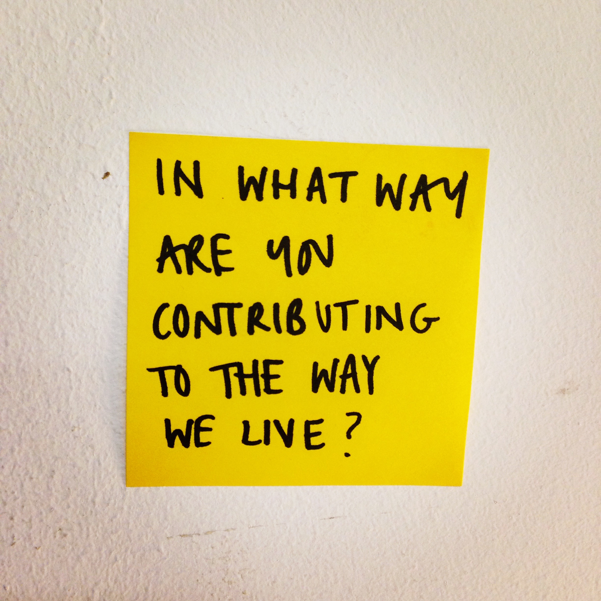
Ben Holliday from Government Digital Service started by asking a vital question:
Designing Better Experiences by Doing Less took us through a brilliant case study from GDS around the re-design of carers allowance. Ben took a concept from Malcolm Gladwell's David and Goliath book around the 'inverted u-curve' and reframed it to be relevant to designing services. Brilliant.
"Inverted U-curves are all about limits. They illustrate the fact that 'more' is not always better" - a good way to tangibly think about the reality of 'simplifying' that we all battle with.
He also talked about Hans Monderman, a traffic engineer who hates traffic signs. He puts up with the well-placed speed limit placard or a dangerous curve warning on a motorway, but Monderman considers most signs to be not only annoying but downright dangerous. To him, they are an admission of failure, a sign - literally - that a road designer somewhere hasn't done his job. His story is inspiring and worth reading.
"The trouble with traffic engineers is that when there's a problem with a road, they always try to add something," Monderman says. "To my mind, it's much better to remove things."
Ben's "Circle of Mistrust" feels relevant to the wealth of good work happening in the public sector ( folks like Future Gov, Policy Lab and of course Snook ) This would have been really useful in the early development phases of MyPolice particularly to share with the police forces themselves.
David Travis from User Focus talked through 7 deadly sins of user research. We all know there is still bad user research happening and despite these being obvious I think it's always good, if slightly deflating, to be reminded that this way of working is very far from the norm.
“People don’t have reliable insight into their mental processes to provide designers with the insight they need”
I liked his use of the fight club analogy when sharing the first rule of finding out what people want. The answer? Don’t ask them what they want. Instead, observe and prototype.
The focus and sole use of the word ‘user’ made me feel uncomfortable and there was a distinct lack of context around real people, stakeholders and the wider ecosystem that a product or service lives in.
David strongly advised against outsourcing ‘user research’ to an external agency. At Snook this is a sentiment we have always felt strongly about, although in the public sector the outsourcing is often the first step. Snook recently co-authored a paper with the Design Managers Australia exploring principles and learnings from working both inside and with public sector organisations. One of our designers Keira Anderson has been working inside a charity for over 6 months. Restarting Britain is a great resource for case studies and recommendations in this space.
This conversation needs to shift beyond basics and start pushing the boundaries of design-led research. Drawing personas and popping a few cultural probes into peoples homes isn't good enough. We need to invent better ways of understanding people that have the same level of rigour but more experimentation. Snook's project The Matter touches on this by skilling up the 'users' ( in this case young people aged between 16 and 24 ) to be the researchers themselves.
Leslie Fountain, the CEO of Foolproof asked an interesting question:
How do you apply lean and start up experiences and methodologies to organisations that are 100’s of years old?
There are great people and projects out there operating in this space - Mind Lab, Civic Service, Mayo Clinic, Better by Design and is something Snook spend time and energy on particularly around embedding design inside government. From a public sector perspective, the literature from the MindLab is excellent. Hyper Island are also making this happen with their business executive work with clients like Unilever who are 85 years old and Coca Cola who are 122 years old.
It also reminded me of Jason Fried's latest project, The Distance. I think it's focus is admirable.
"The Distance is a magazine that spotlights longevity in business. We tell the stories of entrepreneurs who often get overlooked in traditional business journalism. Each month, we publish one in-depth profile of a business that’s at least 25 years old. Our stories give insight into those mom-and-pop businesses, neighborhood storefronts and unheralded companies that are typically absent from the news cycle."
Robert Fransgaard was good fun and made me smile. He presented a timely reminder of how young the internet is. After all, you don’t ever hear anyone say...
“My grand dad designed the web standards for HMTL's mark up language"
His main question was what can we learn from other disciplines. The one I took away with me is what we can learn from music. The Global Service Jam is a sterling example of taking the 'jamming' behaviour and mindset common to musicians and applying it to the design process. Robert's team at Salesforce often choose tunes to associate with their pitch so the music can lift the teams energy to the same place - will definitely be trying this out with teams at Hyper Island. Oh, and he says we need to read this and this.
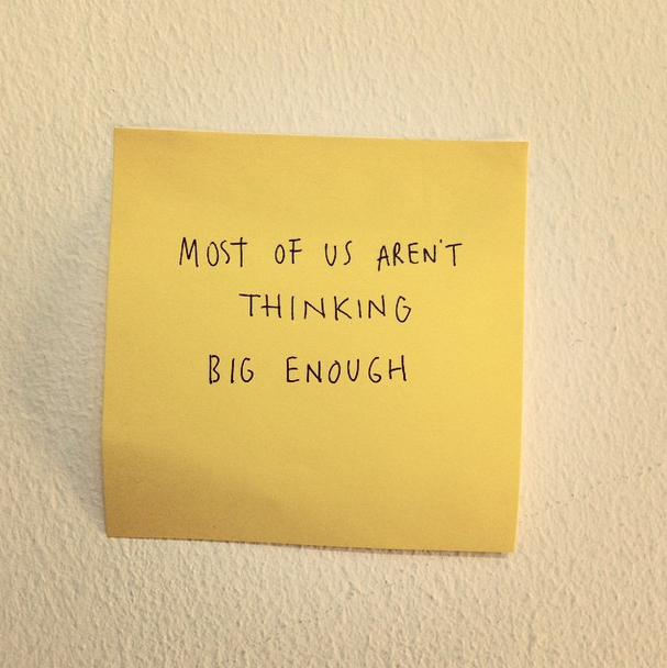
Last but not least, I think Paul Adams was the best speaker with the best content. He started with this and got my attention.
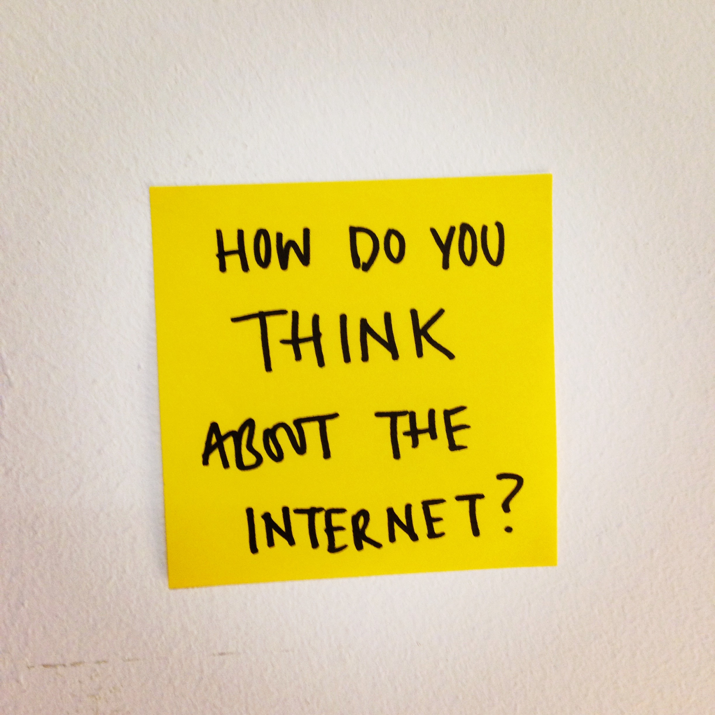
He also asked this question...
Well, do you think about apps and websites or do you think about networks and systems? The latter is most definitely the perspective that I'm interested in and where I think we should all focus our attention. He took us on a brief history of other systems that have transformed our world like the road network and electricity. I would have loved to have seen more unusual examples. For instance, how would thinking this way change the framing problems around ebola or the housing crisis?
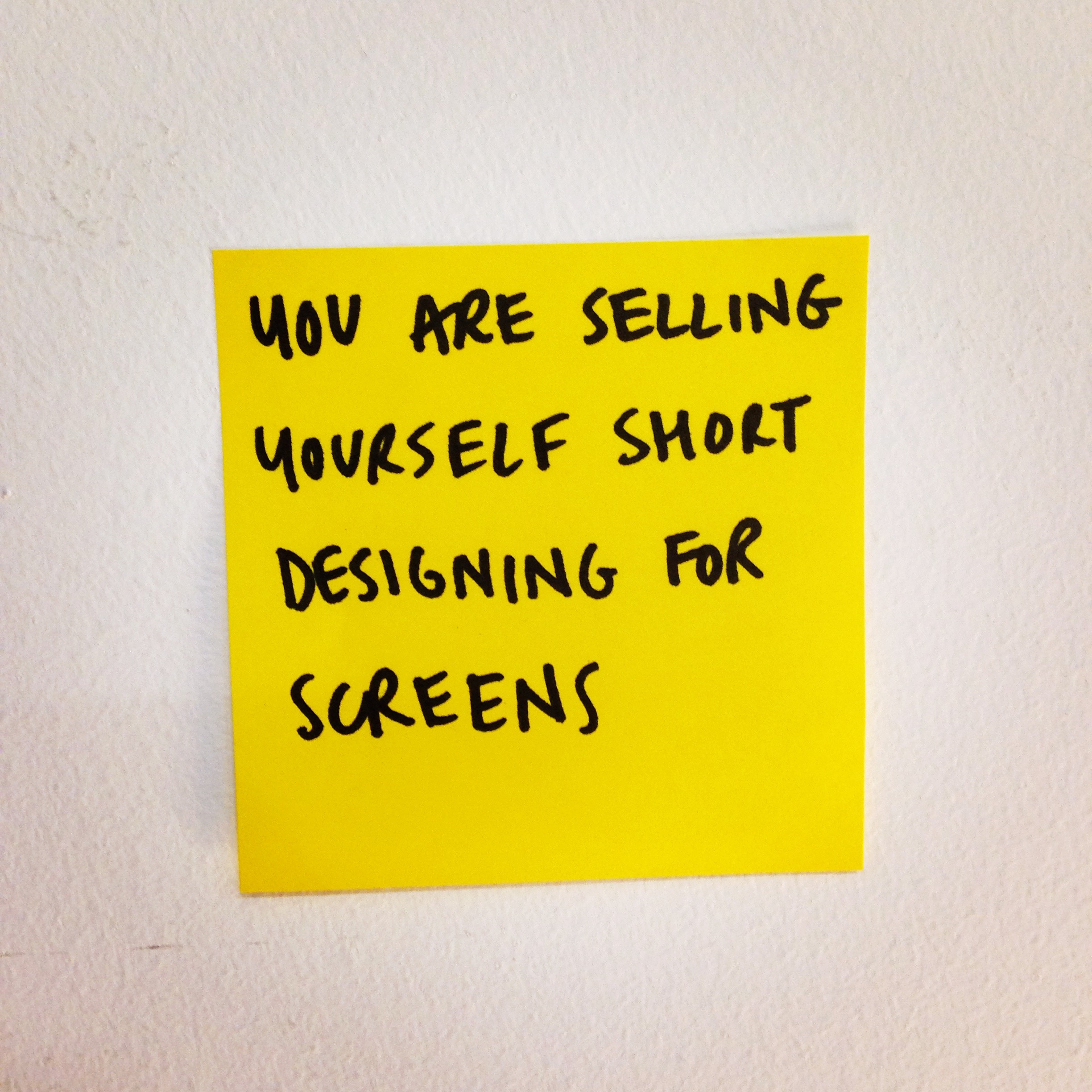
Paul believes that screens are becoming less important, apps are dying and cards are the future of the web. Hear Hear ( admittedly before this talk I didn't know what cards were but now that I do I reckon he's onto something )
To recap. Three things:
- Think in networks
- Design systems
- Card, not apps
Geoff Mulgan recently wrote a good article on the topic of systems thinking. I'm on the hunt for examples and stories of how to introduce students to this if anyone out there has any links or ideas?
“I’m convinced that the ability to think and act systemically is the greatest intellectual and practical challenge of this century"
My friend Cassie and her peers at the Point People created this resource to explore and debate systems thinking as well as showcase examples. The interviews they carried out also highlighted important tensions and questions:
Is it is possible to design for systems change at all? Is systems change revolutionary or an evolution? . Is systems change an elitist discourse that excludes more than it enables? Do organisations and institutions play a key role in achieving systems change; or are they obstacles, part of the old system that gets in the way?
I am a huge fan of everything Margaret Wheatley says, writes and thinks in this space as well.
"But the causes of today’s problems are complex and interconnected. There are no simple answers, and no one individual can possibly know what to do. We seem unable to acknowledge these complex realities."
Paul aired an obvious elephant in the room around language and vocabulary by reminding us that terms are interchangeable - it doesn’t matter what you call it - what does matter is we raise our game. Devices and screen sizes don’t matter and paying too much attention to that stuff is a dangerous path to go down. Where does an iPhone stop and an iPad begin? ( love this question ) This is such a grey area and it’s changing and evolving every day. Instead Paul suggested we focus on access.
Oh, and yes the BBC homepage does look just like a newspaper. What’s that about? It’s not good enough. We need to think deeper and wider. My friend Rohan is a great example of this - he posed the question "How can technology enforce positive habits of the mind?" asking questions such as:
- How do we create interface design that rewards patience?
- How do we design email systems that represent people and not information?
The 5 important things that were missing for me were:
1. Offline experiences - very few experiences are solely digital
2. When the digital meets physical - from internet of things to touchpoints
3. Acknowledgment and exploration of the complex ecosystems these products and services live in
4. Emotions - this stuff is about human beings and why we behave the way we do
5. A sense of what this community stands for
I left with questions around the two seemingly distinct communities of User Experience and Service Design. You might be interested in Snook's take aways from the Service Design Network conference in Stockholm. I was glad to see from twitter I wasn't the only one asking these questions. I think the two communities could learn a lot from each other and only good things could come from getting to know each other more and sharing.

The immediate differences seem to be:
1. Service Design orchestrates all elements of the service—including people, communications, processes, time, technology, physical space, objects, and information—holistically.
2. Service Design thinks about the end user but also the service provider, buyer, seller, maker and any other relevant stakeholders. They are all treated with equal weighting throughout the whole the process.
3. Service Design focuses on the end-to-end experience of an entire journey through time and various touchpoints and channels.
4. User Experience prototypes are wireframes or clickable, working user interfaces. In service design, service prototypes are often three-dimensional, physical environments that illustrate the various service channels and types of users who are involved in the service. This wee video shows a service prototype we built a couple of months ago...
5. User Experience is much better at measuring and crunching data around impact
[vimeo 105554006 w=500 h=281]
Know Sugar from Snook on Vimeo.
I'm looking forward to getting to know this community better. I had an interesting day and massive kudos to the NUX gang who pulled off such a huge event. Big round of applause and thanks for having me! I'm now tuning into Collaborate in Bristol.
PS. I moved to Manchester one week ago :) Who should I be talking to and where should I be going?
