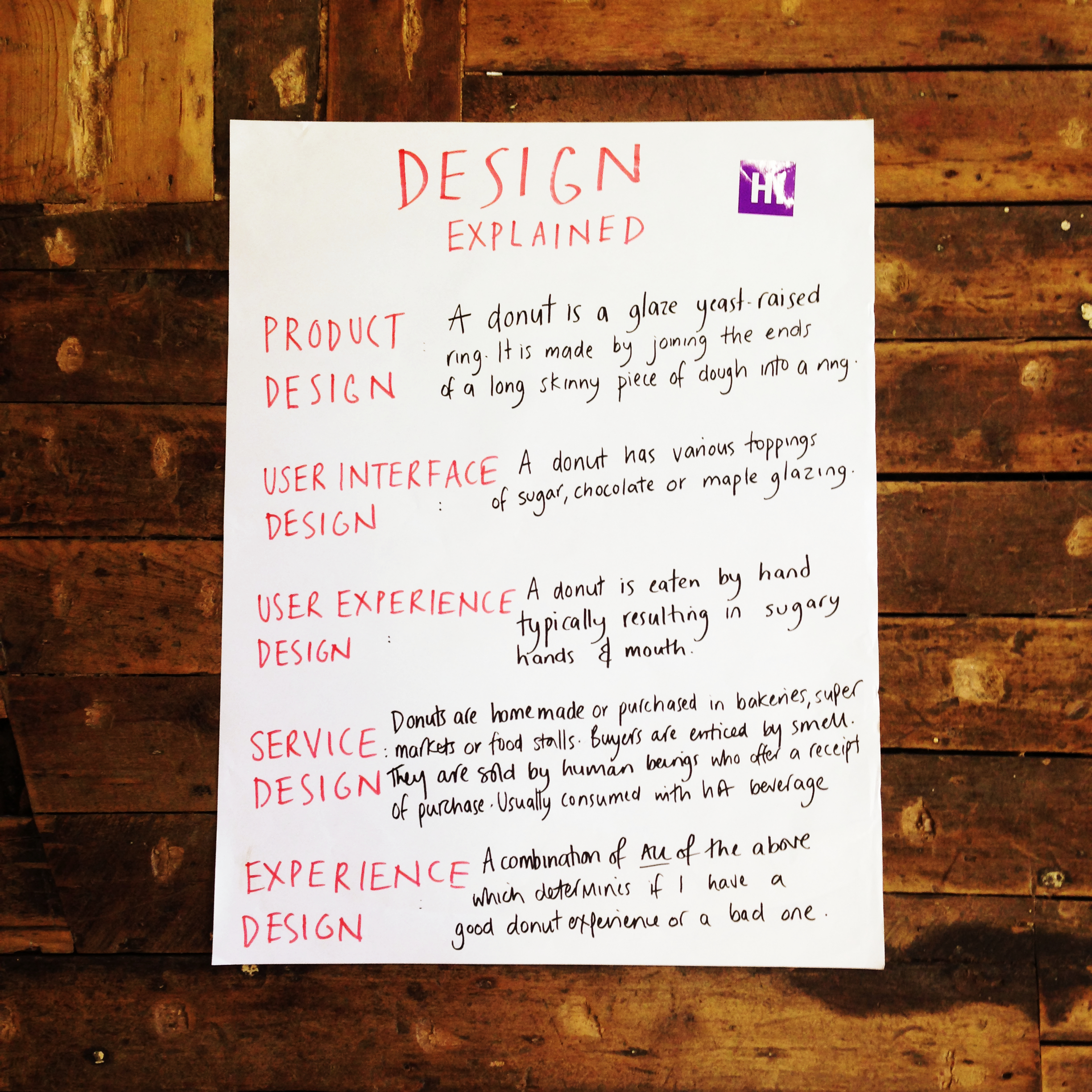
Design explained by donuts
Two years ago, a clever guy called Douglas Wray posted a whiteboard breakdown of all the major social media services and explained how they differ from each other using the example of a donut. Quite fittingly he posted the image on Instagram–the photo sharing service and since then it has been helping lots of people understand what all these channels are and what they are used for.

I think design terminology could also do with a helping hand from this donut explanation. The word design has become more mainstream and now terms like product design and fashion design are common and understood whereas terms such as service design and interaction design are still ambiguous titles that mean different things to different people. Throw experience design and social design into the mix and the boundaries become even more blurred.
I'm a big believer that trying to define this stuff is not the best use of our time - what we should be working on is doing the work and practising these processes - and the results speak for themselves. However, when it comes to education these labels are important ( for students, employers and educators ) and this is a conversation I've been having with my colleagues at Hyper Island, as well as our industry connections around the new MA in Digital Experience Design and how that encompasses various design disciplines, methods and processes.
Inspired by Douglas's social media version I've created Design Explained... it's a first draft and I'd love to hear your thoughts on how it can be simplified and clarified even further. What do you reckon? ( click on the pic to zoom in )

