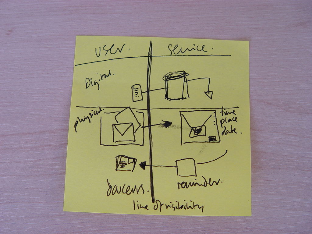
We design un-pictureable things
Would you believe that the humble post - it note is causing quite a debate over at Fast Company. James Hunt is adamant they should be thrown out of the designers toolkit.
"It's time to put that ubiquitous design photo of the Post-it to rest. Give it a break. Retire it."
Now I think this is a little extreme but it did get me thinking. Post-it notes seem to go hand in hand with the service design process and I photograph post-its ALOT! But something Snook have become conscious of lately is the amount of websites and portfolios that showcase a random image of a wall of post its. What does this tell us? Well, not very much to be honest because we can't see what is on the post-its.
"Post-its are visually arresting and like rolled-up sleeves, glasses on the table next to an open fountain pen, beautiful people on cell phones , architectural plans and cups of coffee on a conference room table they are visual shorthand for "hard work is being done here, we're busy innovating!"
I like the response from one reader - "I suppose next you'll be warning us that those who sketch in moleskines lack creativity". He is right, everyone has to find the tools that work for them and the way they like to do things.
How to tangibly capture what we are designing is a challenge service designers face. So I suppose the lesson here is always look at a picture through someone else's eyes - what does it tell me? what do you learn from look at it? what impression does it give?
"Designers themselves are producing increasingly immaterial--and un-pictureable--things.Whereas designers used to make buildings and interiors and posters and toasters, they now are just as likely to be designing services, systems, platforms, and protocols."
The picture of the post it note was drawn by the fabulous Gill Wildman during a session about Douceurs.
What is the best use of post-it notes you have seen in a service design context?

