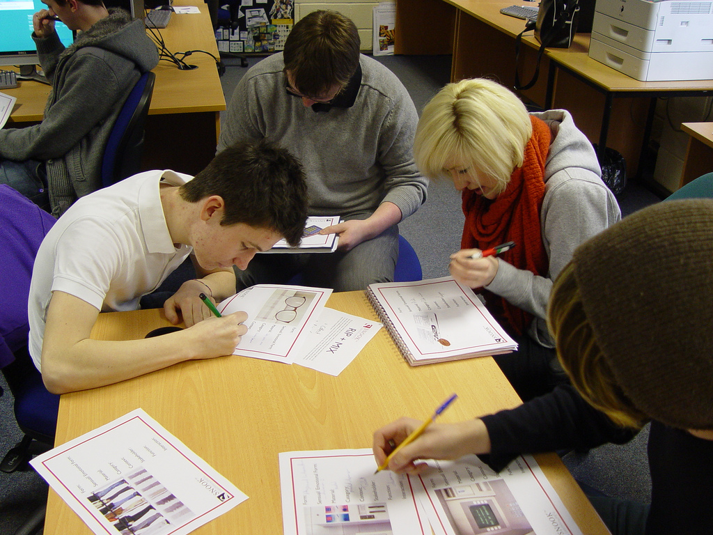
Rip and Mix at Glasgow Caledonian University
Rip and Mix is a creative process. It is a tool that enables you to come up with lots of ideas very quickly. It is a very visual way of working and highlights that starting with user needs is not the only approach to innovation. The tricky bit is sketching ideas very quickly and intuitively. This month I spent an afternoon running a workshop on Rip and Mix with design students at Glasgow Caledonian University. In the past I have used this method to design communication products and services for the elderly - ripping and mixing communication products used by a wide range of stakeholders with communication products specifically designed for the elderly. I have used this tool addressing the question "How can we reduce waiting times in NHS surgeries?" - ripping and mixing products and services focused on time and the passing of time with various health services and other services that require 'waiting' such as the theatre...
The students have been working on semiotics and affordance so for this workshop I decided to work around cash machines for the visually impaired - ripping and mixing all products designed for visually impaired people and all products and services around retrieving finance (ranging from physical money to intangible information )
This worked really well as it had a good balance of product / interactive / 3D elements - hence catering for all the disciplines who were there:
"For example, a drawing of a three-dimensional button on a computer screen leverages our knowledge of the physical characteristics of the buttons and, therefore, appears to afford pressing. The popular 'desktop' metaphor used by computer operating systems is based on this idea - images of common items like trash cans and folders leverage our knowledge of how those items function in the real world and thus, suggest their function in a software environment. Mimic familiar objects and environments in abstract contexts to imply the way in which new systems can be used."
You can see photos of the workshops here.
One workshop was held in an bright, open plan room whereas in the other we were confined to room filled with computers. This had a huge impact on the energy of the group. I got asked questions about 'stakeholders' and what that really means. I also got asked to explain the meaning of 'sensual and emotional form' ... this is something that I always use real life examples to explain.
This workshop was about quantity rather than quality and teaching the students how to 'let go' and not be so precious about their ideas. I will be uploading the main ideas generated soon so you will be able to see what elements the students ripped and mixed to come up with new solutions.
Here is some feedback from Dave Wood, a lecturer in Digital Design at Glasgow Caledonia University.
"Lauren's (SNOOK's) Rip and Mix workshop was just what my year 1 and 2 undergraduate design students needed. It enabled them to move out of their design comfort zones and propose, through sketching, twenty ideas each on a design problem. The technique utilises semiotics which really helped the students understand the importance of visual analysis. It was fun, energetic, engaging and above all useful. At a post-workshop de-brief the vast majority of students said they would use the technique in the future on a variety of design problems - product, interactive and 3D. Not one student reacted negatively to the technique - and those who were initially unsure began to see the relevance after the workshop. Overall it was a fantastic opportunity that I'd like to build into next year's curriculum again."
If you would like Snook to come and talk to your students or class mates about Rip and Mix then please do get in touch!

