The End of the World
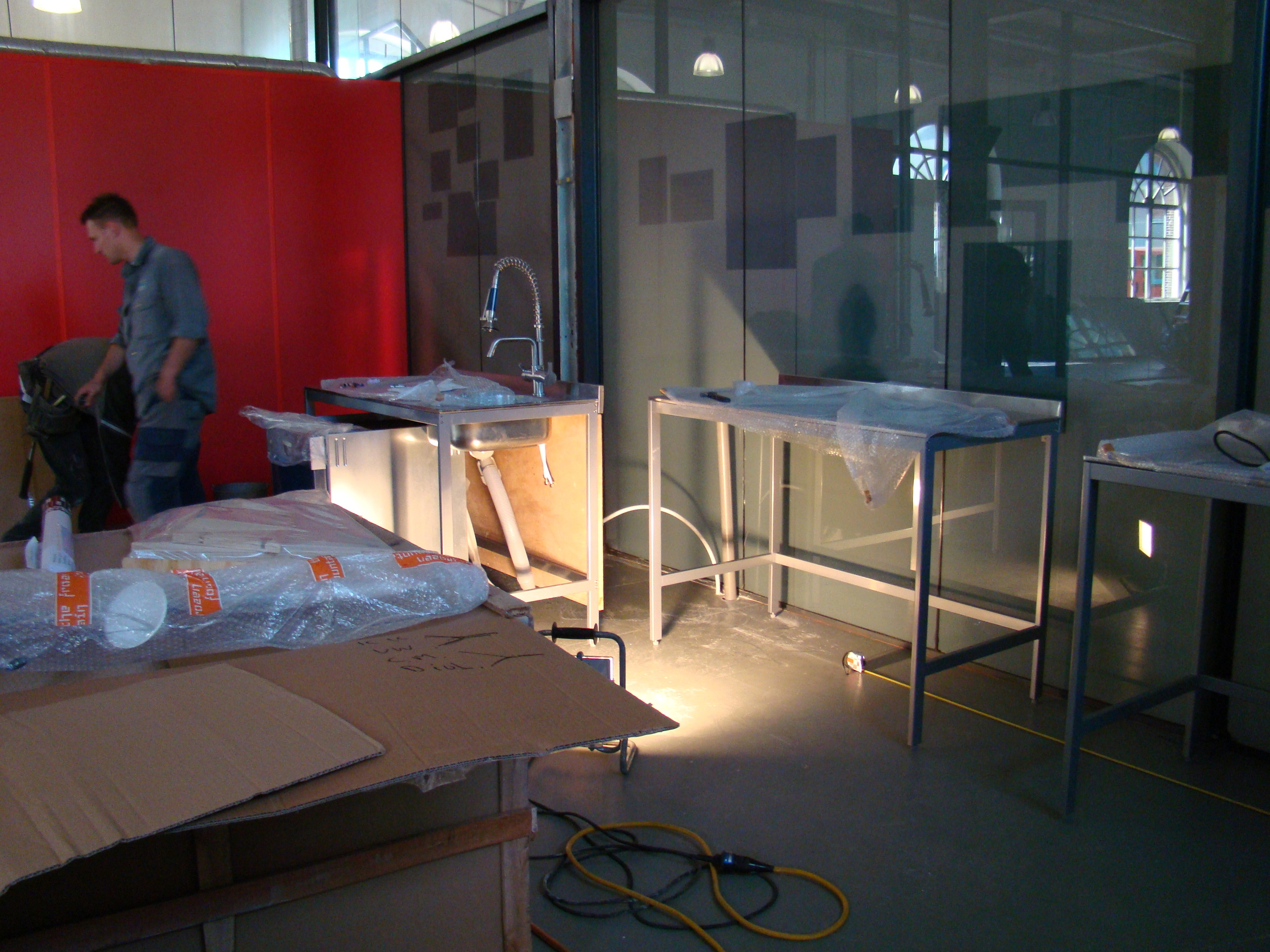
These pictures show the space within Den Helder that DesignThinkers are transforming into The End of The World. The harbour is full of many beautiful buildings, each slightly different.
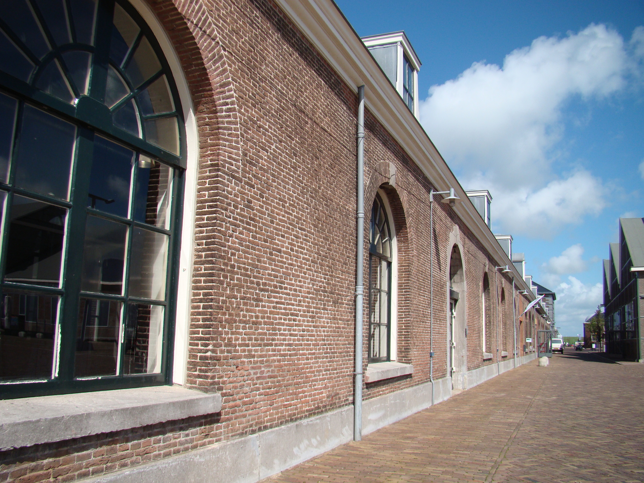
The hallway outside the End of The World will also be used for creativity. The glass walls and huge windows fill the space with lots of light. Very important... when being a design thinker!
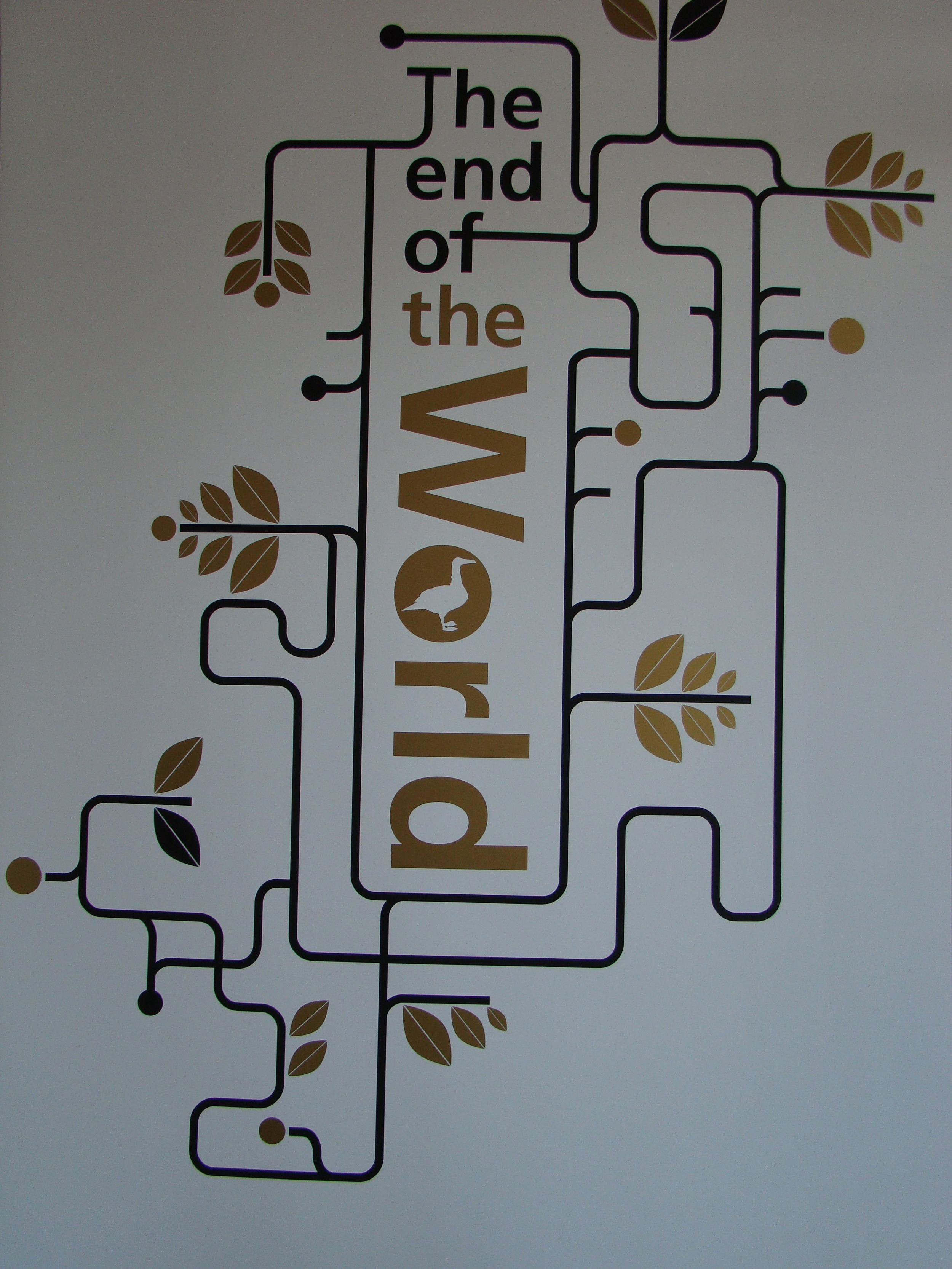
The logo has a very organic and natural theme, although the lines are similar to the lines on the metro map. All this insinuates travel, growth and development. The logo will be beamed onto the walls. Over time it the aesthetics will grow to represent the steady flow of ideas and new insights.
Still lots of furniture in boxes but you get the idea...It is very rural and rustic which I predict will contrast beautfully with the modern decor and seating.
Tim and Arne, the thinkers behind Sloep ventures, discuss how to sign this space so it is clear from the exterior of the building.
